Wednesday 29 March 2017

Cut canvas

Wednesday 29th March 2017
Cut canvas


 I got two mini canvases and sponged on the pattern continuing onto the second canvas from the first. I am happy with how the pattern flows between the separate canvases to bring them together. The tones are cool in this painting with the lighter parts looking like ice because on the technique used to apply the paint. These canvases were quite old and I think this was why the paint bled through so badly through the tape. I’m going to use wooden board more than canvas because I get a smooth line when I paint onto wood.
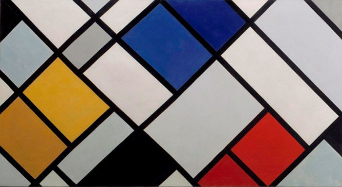
I want to create another piece where the pattern flows from one canvas (or piece of wood) to the next because this is successful and looks more effective than it all being on one panel. If different widths of tape were used it would be more successful because I think the same line looks dull compared.

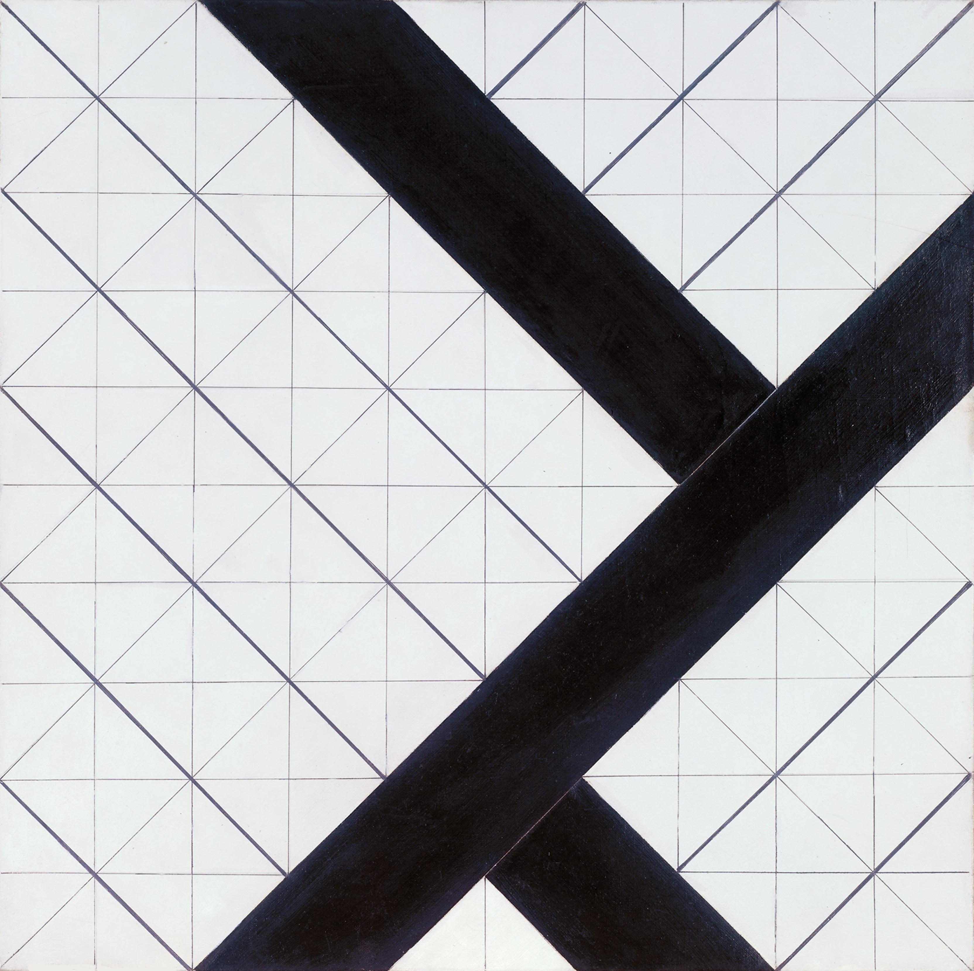
If I were to do this piece again I would use wooden panels and different widths of tape. I would try a more subtle blue so it wasn’t as bold but faint in its appearance.

Friday 24 March 2017

Cubism

Friday 24th March 2017
Cubism

“Cubism was a revolutionary new approach to representing reality invented in around 1907/08 by artists Pablo Picasso and Georges Braque who aimed to bring different views of subjects (usually objects or figures) together in the same picture, resulting in paintings that appear fragmented and abstracted

Picasso is said to have started cubism with his ‘Demoiselles D’avignon’ in 1907. Artworks in this genre break down objects and figures into areas or planes on a canvas, showing different viewpoints at the same time that suggests a three dimensional form. However, this actually emphasised the flatness of the canvas.


There are two types of cubism: analytical and synthetic. Analytical is more severe with interweaving lines and planes. There was also mostly only muted colours used. Synthetic cubism used simpler shapes and brighter colours. It was also one of the first times that real objects were included in the pieces, this lead to “one of the more important ideas in modern art.”


Cubism is described as reducing everything to “geometric outlines, to cubes” which correlates perfectly with my own practice. Looking at cubism has re-inspired my work and I am feeling much more motivated after discovering an approach that my work might actually belong to.


Related artists include:
  • Pablo Picasso,
  • Georges Braque,
  • Juan Gris,
  • Fernand Leger,
  • Jean Mertzinger,
  • Robert Delaunay,
  • Albert Gleizes.

Thursday 23 March 2017

Mondrian

Wednesday 22nd March 2017
Mondrian

I find Mondrian’s work is similar to mine because of the lines he uses that split up each colour and cube. 


·         He was influenced by cubism,
·         Stuck to the 3 primary colours and black,
·         De Stijl movement,
·         Interested in the abstract quality of line,
·         Neo-Plasticism (term adopted by Mondrian to describe his work),
·         Geometric abstraction.


I find the way he uses lines interesting, mixing them with only three other colours. Would the pieces be as interesting with no colour? Or muted colours? I think the colours being so bold is what makes the pieces stand out from one another. 


His non-representational works differ to mine in that mine are representations of scenes that I have sketched, distorted and then shown them in a way that shows my perception. Because of this key difference, I will look at Mondrian’s work solely for its aesthetics qualities. 

Wednesday 22 March 2017

Theo Van Doesburg

Wednesday 22nd March 2017
Theo Van Doesburg
 Theo Van Doesburg was one of the founders and leading theorists of De Stijl along with Piet Mondrian.

His style is very similar to Mondrian’s but Van Doesburg uses more angles and tones in his art, it is a more developed style. I prefer his more fluid way of using geometric images within his work without them being rigid. He is more open to colour in his work which I think makes them more appealing although he will only stick to a certain number in a piece.


I find this piece one of his most interesting because of the grid behind it. Although this is normally something artists would remove after finishing a piece, Van Doesburg made the grid a prominent part of the piece. In comparison, the grids angles is in contrast to Modrian’s stiff compositions. The bolder lines just emphasise there angle and fluidity. It looks structural because of its accuracy and straight lines, which is what I’m wanting within my own work. 

Saturday 11 March 2017

Patterns beneath

Saturday March 11th 2017
Patterns beneath

Instead of creating the pattern between the white stripes I inverted the white. The original painting was one I had done at home but I thought it could be improved by applying the technique id used on my other paintings in this module. Because of the bright blues in the pattern the white couldn’t cover it but I quite like that it isn’t just vast white across the board.


I think my previous pieces look more sophisticated than this one because the pattern is random although the lines are still precise and clean.

Although I like this piece personally, I don’t think I’ll continue to create paintings in this way because I don’t feel like it will progress as well.


Thursday 9 March 2017

Cool colours

Thursday March 9th 2017
Cool colours
My last piece used only warm colours so I wanted to see what aesthetic cool colours would create. The image is based on buildings that had windows allowing you to see the building behind.


The piece is cold with these tones although the lines are interesting. The colours make me think of the sky and the lines like those created by planes. I want other people to be able to be free to see what they do in the pieces without being told what they are because I find it interesting to know other peoples perspectives.


As well as changing the colours I changed the widths of the tape I was using. It makes the piece look more three dimentional and resembles the building and its lines although the painting is distorted from its original drawing.