Wednesday 22nd March
2017
Theo Van Doesburg
His style is very similar to Mondrian’s but Van Doesburg uses
more angles and tones in his art, it is a more developed style. I prefer his
more fluid way of using geometric images within his work without them being
rigid. He is more open to colour in his work which I think makes them more
appealing although he will only stick to a certain number in a piece.
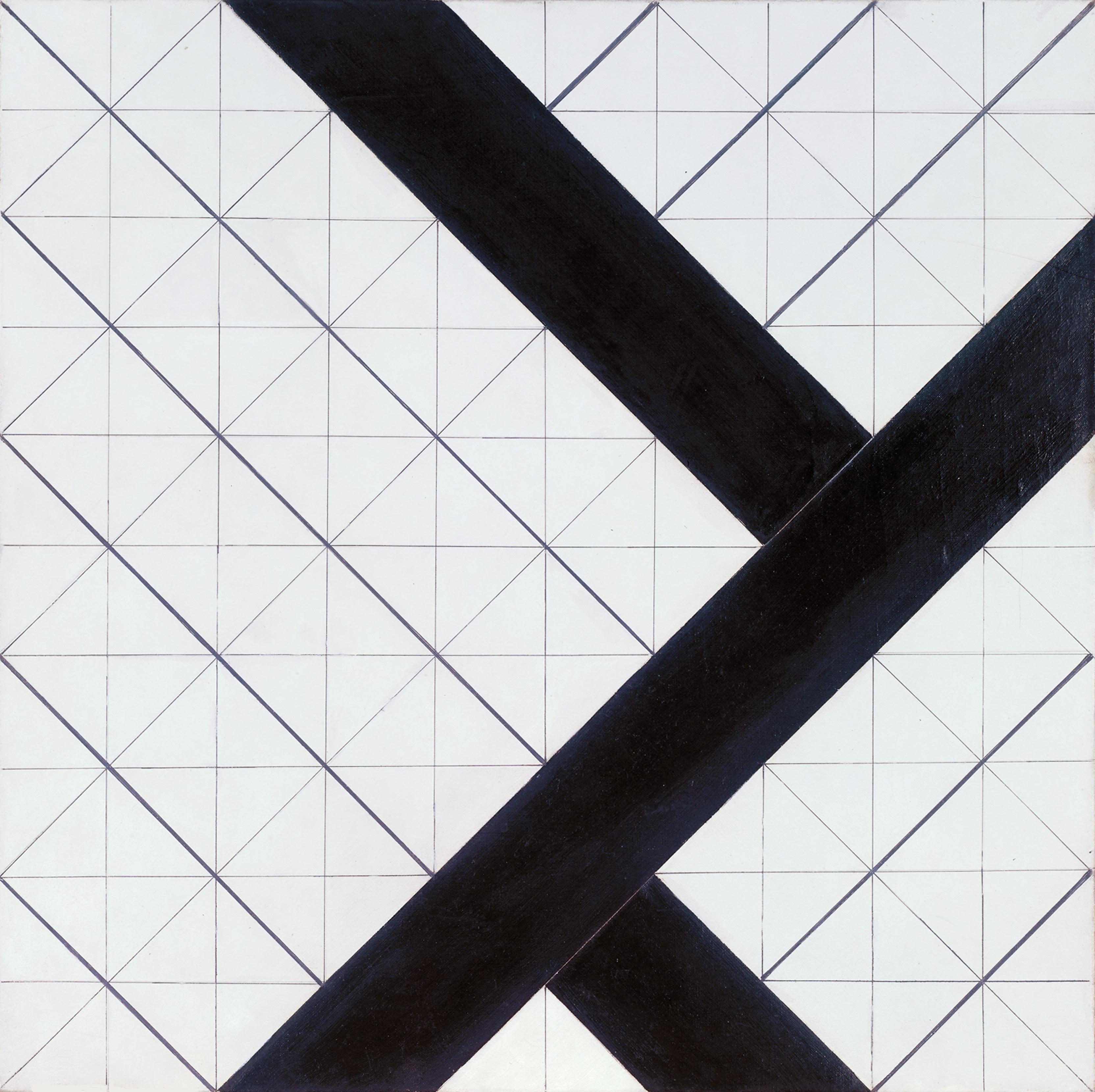
I find this piece one of his most interesting
because of the grid behind it. Although this is normally something artists
would remove after finishing a piece, Van Doesburg made the grid a prominent
part of the piece. In comparison, the grids angles is in contrast to Modrian’s
stiff compositions. The bolder lines just emphasise there angle and fluidity.
It looks structural because of its accuracy and straight lines, which is what
I’m wanting within my own work.


No comments:
Post a Comment