Showing posts with label dissertation. Show all posts

Wednesday, 1 November 2017

Turning to hand drawn images

Over reading week I took a step back and looked at my work I
wasn’t entirely happy. When I was looking at wallpaper samples I had a clear favourite which was almost opposite to my current designs. Although the pattern was originally hand drawn, when it was printed it seemed too mass-produced. It took away the organic pattern and style of the original drawing. I took advice from my tutor and considered why it had to be a single image repeated in such a clinical way. My reasoning for this was that for me, it looked clean and proffesinal when it was presented this way. I decided to just draw and the resonse I got to just a doodle on the wall was so positive I decided to go in another direction with my prints.

I didn’t agree with my peers as for me the drawing was too messy and untidy in design but when I planned out my design instead of automatic draweing the design was much cleaner, more thought 
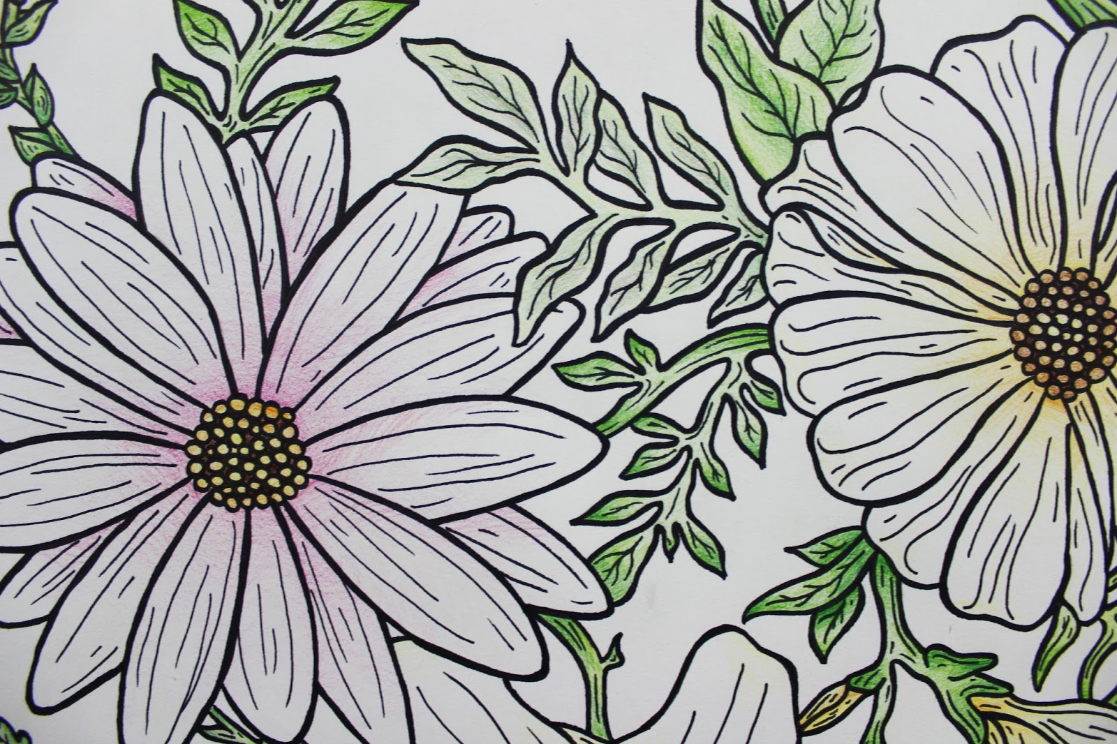
out and cleaner. Because of the detail in the print, to get the important repeat in there I had to trace the pattern and then line it 3 times because I discovered hand-drawing my pattern and having that craft element to the print is very important. You can tell when you see the print that it has taken time and care to create.

The print is different to my original idea because it is a compliation of my research and trial and error. The flowers in this print are all taken from observational drawings that I have so far produced. I like this as it makes the print very personal in that I have captured these flowers and am still drawing from them. The pattern winds and weaves around the paper guiding the eye to different elements and flowers within the piece. Colour adds to this experience as I have added little touched of colour throughout the pattern. Colour was important as it adds to the decorativeness of the piece and makes it aesthetically pleasing, without colour the strip of pattern looks like a colouring book with bold black lines.

The end piece was just over six foot in length and I decided to display it on the wall like it would be if it were being pasted on the wall for wallpaper. I stuck it flat to the wall and from the top of the skirting board. This made the piece look decorative as a piece of wallpaper.

I would ideally like to create a longer piece so that it could cover the length of the wall and I would also like to make the repeated pattern more prominent so that the viewer would be able to see the reason behind the pattern. 


Monday, 23 October 2017

Possible Final Design

I created another drawing but one that could stand on its own without needing to be connected to another piece to make it flow. This pattern is my favourite so far because it is simple but with plenty of detail. Its clear the original is hand drawn which is important to me as I want my wall paper to show skill and effort.

I tried putting this image in a pattern to print onto wallpaper. When I just put the image into straight lines it looked too formal to be wallpaper and boring. I experimented with different designs to see how I could make it interesting to look at if it were to cover a whole wall or room. After trying multiple different patterns I decided rotating the pattern through lines was the one which looked the most aesthetically pleasing. The turns are to symbolise the different ways the flower can be viewed however the print still looks too stiff and not organic.


I also experimented with backgrounds but it took away from the design and from looking at other wallpaper samples I decided I would definitely not be having a background. It made the pattern look too busy even on a small scale. A blank background makes the pattern stand out much more and looks more clean and professional.


Thursday, 19 October 2017

Wallpaper Samples

I went to a DIY store and looked at floral wallpaper samples to see what qualities they commonly have. This sample was a favourite of mine because the collections of flowers look like they are coming out of the shadows behind. It has a blank background which makes the flowers stand out a lot more than if there was another pattern behind. The soft colours are also attractive to me because they are not garish like others.

This sample is very different from the others as there is a pattern stretching behind the roses. The pattern distracts from the roses and makes the overall presentation look busy and unorganised. The colour scheme being very similar throughout the sample makes it difficult to see the roses that are meant to be the most prominent feature. Because of this I don’t find it aesthetically pleasing, which is very important to me in my work.


 Although the flowers in this wallpaper are too animated for my liking, the bright colours distinguish what is the main focal point of the pattern. The way the pattern follows on from each other from a vine is attractive as it leads the eye through the pattern. However, the pattern is very simplistic and doesn’t have many elements to it. Because of this the viewer can’t be intrigued about the pattern because there is very little to it.   

This pattern is like the previous in that the pattern runs through the roll by a connecting leaves and vines. This sample is more realistic and with a much more muted colour palate to the previous. However, it has gone too far the other way and isn’t eye catching with such little colour and substance to the pattern. The outline of the flowers without colour makes its centre more of a focal point, but it still lacks much detail and substance.

 This sample is by far my favourite. The pattern leads the eye through the wall with different elements. Although I think that the dragon flies and butterflies are unnecessary I understand that this wallpaper is for domestic use. The different colours entice the eye and the simple pallet is aesthetically pleasing. The darkness of the background really makes the light colours stand out but I imagine this to quite an unpleasant background colour if it were to cover an entire wall.  

From looking at these different samples I have decided that the pattern I want to create for my ‘wallpaper’ will have a plain background so all the detail can be centred on the pattern itself. I also want there to multiple flowers running through it so that there’s substance and makes the pattern aesthetically pleasing. My ‘wallpaper’ will be coloured but I want to stick to a simple colour pallet so I don’t take away from the effect of the pattern.

Monday, 9 October 2017

Claude Monet

Oscar-Claude Monet (November 1840 – 5 December 1926) was a founder of French Impressionist painting, and the most consistent and prolific practitioner of the movement's philosophy of expressing one's perceptions before nature, especially as applied to plain-air landscape painting. Masterful as a colourist and as a painter of light and atmosphere, his later work often achieved a remarkable degree of abstraction, and this has recommended him to subsequent generations of abstract painters.

Inspired in part by Edouard Manet, Monet departed from the clear depiction of forms and linear perspective, which were prescribed by the established art of the time, and experimented with loose handling, bold colour, and strikingly unconventional compositions. The emphasis in his pictures shifted from representing figures to depicting different qualities of light and atmosphere in each scene.

Monet has long been one of my favourite artists because of his use of colour and his application of the paint in his paintings. In 2016 I was lucky enough to view Pink water lilies (1897-1899) in the Galleria Nazionale d'Arte Moderna in Rome. The painting’s pastel pallet and soft brush strokes combined with Monet’s subtle changes of colour create an outstanding piece of artwork. It is of no surprise to me that the paintings in Monet’s Water Lillie series are classes as masterpieces. His work is much more expressionistic than my own as in my current work I am favouring a more stripped back clinical drawing style. Looking at Monet’s work has influenced my decision to look more closely at the flower itself and to create more detailed drawings focusing on the object instead of the medium in which I am presenting it.

Tuesday, 3 October 2017

Anya Gallaccio

Anya Gallaccio (born 1963) is a British artist, who creates site-specific, minimalist installations and often works with organic matter (including chocolate, sugar, flowers and ice).


Her use of organic materials results in natural processes of transformation and decay, meaning that Gallaccio is unable to predict the end result of her installations. Something which at the start of an exhibition may be pleasurable, such as the scent of flowers or chocolate, would inevitably become increasingly unpleasant over time. The timely and site-specific nature of her work make it notoriously difficult to document. Her work therefore challenges the traditional notion that an art object or sculpture should essentially be a monument within a museum or gallery. Instead her work often lives through the memory of those that saw and experienced it - or the concept of the artwork itself.

Although Gallaccio uses the literal flower instead of its image, I find her work important to my practice because at its core is natural materials. Gallaccio uses the natural materials directly where as I perceive them in drawings. A number of her works are centred around the preservation and decay of natural materials, in my practice I wish to preserve the image of the natural material through drawings.


preserve ‘beauty’ is an installation work composed of bright red flowers arranged in four adjacent rectangular compositions underneath large panes of clear glass. The flowers are presented in a single layer with their heads facing out towards the viewer, and their stalks are positioned downwards, so that the lower edge of each panel features a band of green made up of the stems of the bottom row of flowers. The type of flower used in the installation is a hybrid between a gerbera and a daisy that is known by the name ‘beauty’. During the period in which preserve ‘beauty’ is displayed, the flowers wither and die, and this decay process is visible to viewers through the glass.

Monday, 2 October 2017

Ambrosius Bosschaert

I felt it was important to look at a historical flora and fauna painter as my practice at current is based around the representation of flowers. Ambrosius Bosschaert the Elder (18 January 1573 – 1621) was a still life painter of the Dutch Golden Age.

Bosschaert became one of the first artists to specialize in still life painting, and he started a tradition of painting detailed flower bouquets, which typically included tulips and roses. His bouquets were painted symmetrically and with scientific accuracy in small dimensions and normally on copper. They sometimes included symbolic and religious meanings. 

Thursday, 28 September 2017

Proposal

For my proposal I wrote about how Wassily Kandinsky, Yayoi Kusama and Mark Rothko can be compared. These artists (as far as i know) have never been compared but they are the three artists that have most influenced my work over the years and more recently. They all use the formal elements of shape, colour, form and pattern to express their feelings and emotion in their work. this is what i wish to focus on. I want to make my dissertation more foccused on how they use the formal elements to preject their work.