Showing posts with label studio. Show all posts

Monday, 23 October 2017

Possible Final Design

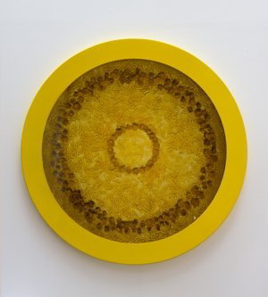
I created another drawing but one that could stand on its own without needing to be connected to another piece to make it flow. This pattern is my favourite so far because it is simple but with plenty of detail. Its clear the original is hand drawn which is important to me as I want my wall paper to show skill and effort.

I tried putting this image in a pattern to print onto wallpaper. When I just put the image into straight lines it looked too formal to be wallpaper and boring. I experimented with different designs to see how I could make it interesting to look at if it were to cover a whole wall or room. After trying multiple different patterns I decided rotating the pattern through lines was the one which looked the most aesthetically pleasing. The turns are to symbolise the different ways the flower can be viewed however the print still looks too stiff and not organic.


I also experimented with backgrounds but it took away from the design and from looking at other wallpaper samples I decided I would definitely not be having a background. It made the pattern look too busy even on a small scale. A blank background makes the pattern stand out much more and looks more clean and professional.


Monday, 16 October 2017

Patterns and Scale

I like my work to look clinical as I believe it looks more professional and clean when it is presented. When something is messy and out of place in a piece it causes slight OCD tendencies.

Without the pattern in my work, it eliminates the reason for looking at the Fibonacci sequence and natural materials (flowers). I decided to look at scale again but oppositely to how I previously considered it in my work. I made the flower pattern smaller. I made the pattern even smaller so that it became almost like an optical illusion. From further away it doesn’t look like a flower at all but a few dots on the page, until you get closer and see the drawing. Although the smaller scale makes the image interesting to look at, I want you to be able to see the drawing of my work. If you can’t see that the image is a flower then it might as well be anything. It is important the image of the flower can seen otherwise it has no links to the sequence. 

This drawing doesn’t work best as a sequence because the eye is drawn too much to the centres of the flowers, they are too dark in contrast to the rest of the image. As a pattern spread across a wall like wallpaper it not be as aesthetically pleasing as other drawings is have created.


Friday, 13 October 2017

Scale and Paul Morrison


While looking at my line drawings my tutor suggested I look at the scale of which I was drawing them. He helped me to print my drawing out large like an artist who he introduced me too: Paul Morrison. Although he went to University in Sheffield (where I’m from) I wasn’t familiar with him but found my work really relates to his. He creates botanical drawings, mainly in monochrome. His “boldly rendered gardens and landscapes are magnified, distorted, and cartoon-like, appearing through various mediums in paintings, drawings, prints, sculptures, and film. Morrison consciously shifts scales and takes inspiration from timeworn engravings, botanical illustrations, comics, animations, and found images.”

On a photo of his works you do not guess that it is as tall as a building. This made me think about scale within my own work and when we blew my drawing up large the overall image was arresting on the wall because it invaded the space with how much larger it was.


I aesthetically appreciated how my drawing looked large however if I were to make them all this big I would unfortunately not have the space to include the repetition of the flowers, thus getting rid of why I’m using flowers in the first place; because they follow the Fibonacci sequence.
I also found that when I blew the image up the quality of the image recreated and became pixilated and not sharp. If I were to create drawings with the intention of them being large scale I would make them larger to begin with to get rid of this problem. 


Monday, 9 October 2017

Circular prints

After trying to print with rectangular sheets of lino I tried circular to see if this would look better once printed. I used a small piece of easy cut that I got in a set instead of lino to see if it would be easier to use. The material is hard to carve and smudges easily when printing. I won’t be using this material to print with as I don’t think it gives a very precise print. It was hard to control the material when carving so the depth of the lines are very different. Although the circular shape is more interesting to look at than my previous prints, I can’t get any detail into the print because they are too small to carve a detailed image into.


First lino prints

To get a more accurate print I chose to try lino printing. This technique is easier than using wood carving like William Morris and a lot less time consuming. I used a () to draw from as I prefer to draw from either observation or my own images.


t has been years since I used lino printing and at first, I could not get the quantity of the ink right on the print. There was far too much and it made the print unable to display the image because the ink was getting into the carves. And then there was too little ink so you could not see the image or it moved while I was printing so the image was smudged.


Eventually I got the technique correct and got the image I wanted. I still wasn’t completely happy with the print so I got rid of the background so that the flower had a boarder round it so the image could be repeated without there being too much black. 

I like final prints but I still think they are not precise enough for what I was wanting to achieve by making my own wallpaper. I want to experiment more with printing to see if I can get the prints more precise. The overall look is still too messy and uneven. I also want to experiment with the shape of the print to see how this would look if it was a repeated pattern on a wall. This was only a small any would confuse the eye if it was on a whole wall so I want to experiment with scale.

Sunday, 8 October 2017

Printing with natural materials

I was asked why I wanted to print with flowers and it was suggested that I try using other natural materials. I got a Romanesco broccoli which is one of the best examples of fractals and symmetry in nature, and a pineapple which also shows symmetry in its outer patterns.

Both materials were difficult to print with. With the Romanesco broccoli, it was difficult to print its patterns because there are so many dips that you can’t print. Although the object itself is interesting enough to be a piece of art, I would have loved to have been able to print its fractals. I rolled the broccoli across the page to see what marks that would make and it was not successful because they are just dots front the highest points. I also tried just printing a small floret which worked better because you can see that natural pattern more. 

I next tried printing with a pineapple. The prints I got from the pineapple were less successful than the broccoli. I was hoping you would at least be able to see the almost honey-comb pattern around the outer skin but it would not print so it was visible. I tried rolling the pineapple through paint to try and get the pattern but it resisted and would not print well. I rolled the pineapple across the page, like I did the broccoli, but because if its shape not being flat I couldn’t get the pattern to print. I also tried printing the bottom of the pineapple which I think it the most successful print as it looks interesting but it does not look like a pineapple and you cannot see the patterns that I was trying to demonstrate.

Both prints in my opinion were failures. They didn’t create the desired image of interesting prints, the prints don’t look like they have come from a Romanesco broccoli or a pineapple. I will contue to research prints and the how to gain the best results however, I will be developing into lino printing instead of printing with the natural material in hope of getting a clean precise image/print.

Thursday, 1 December 2016

Studio - Family photos

in the crit the photos id combined together of my grandparents wedding got the best feedback so i have decided to return to this and develop this side of my practice and move away from flowers to focus more on the generations/family aspect. 


i found and scanned images of family photos of when i was young which were in colour and different to my first collage.

i tried it in black and white to see if it would have the same effect as the first one but because the images are clearly more modern the black and white effect does not work as well. when i present the series i'd like to see the progression through time and i think changing from black and white to colour photography is a big part of this.


Dsineyland Paris, 1999

Italy, 1979

Lanzarote, 1998

Monday, 21 November 2016

Studio - combining flowers


i combined flowers instead of photos to convey different periods in different peoples lives.
i chose to use the birth flower of august to represent my life at this point (new born) and a wilting flower for my granddad.
i like the look of the finished piece because you really have to look through the image to make out the flowers because it is so busy with multiple images.

Thursday, 10 November 2016

Studio - combining photos

in the crit an idea someone gave me, in response to my recent flower combinations, was to combine multiple photos together instead of just two.
i started with combining all the photos of my Granddad and Grandma's wedding. the end result is a canvas of black and white unclear shapes. i like how you can only make out images within the piece if you study it closely. i think it would have been more successful if there were less images so they were clearer to make out.

the next collage i created was with just group photos from the wedding. because the photos are black and white it makes the collages have an eerie quality, it makes me think of memories in the mind. 

This was using just photos from the wedding of just my grandpa and grandma.

this collage combines photos of when my grandpa was young

And this was just two photos combined of young and old photos of him

for this collage i used an image of when she was a baby, young girl, her wedding, her with her children and the final nice photo we have of her. i combined them all together to make a collage symbolising her life.


i think the most successful was the first one because it doesn't look like photographs until you get closer to it.

Wednesday, 9 November 2016

Studio - opacity flowers

I prefer using my own drawings instead of  photos found on the internet as it makes the art more personal. i still wanted to combine the family photo and the flower and experimented with layering them on top of each other, changing the opacity.


I think this series is a lot more successful than the previous because they are my own drawings and because the flowers are not as obvious. the first one (the baby) is the most effective in my eyes as the flowers cover the image. I don't think the rose works as well in the wedding photo because its too busy and full, i think it would have looked better if id have placed it only slightly in-front of their faces or lowered the opacity even more.


Monday, 7 November 2016

Studio - photo-shopped flowers

I tried combining the photos instead of having them separate to make them one image instead of two separate elements.
Jasmine, Cape: I am too happy
Camellia Japonica, White: Perfected loveliness
Rose, red: Love
i wanted to also see what it would be like to move away from flowers and just combine the generations in one photo. i like how its unclear to make out who the little girl is because there's such an age gap but i also like how it looks as though shes just an on-looker because of both photos being in black and white.

Saturday, 29 October 2016

Studio - flowers representing the life cycle.

i decided to look at photos of my grandma throughout her life and find flowers which best represented the stages in her life. 

Baby's Breath: Innocence, pure of heart.
Primrose: Early youth.
Red rose: Love.

i find it interesting how flowers can have so much meaning behind them without people knowing it.

Monday, 24 October 2016

Studio - week 4 crit

In the crit last week i got some really good feedback for my idea of looking at flowers in relation to a humans life span. a question which was asked was whether or not i should move away from flowers and look purely at the human side of my work however, i love working with flowers and it has become a crucial part of my own practice which is why i think i will carry on with working with flowers.


Georgia O'Keeffe was a name that was mentioned because of the symbolism in her work. because i'm looking predominantly at women's lives (flowers are feminine) id like to create some work that looks closer at the flowers forms.


Mary Kelly's Mother and child work was also mentioned. her work shows the relationship between her and her new born son in media other than just photographs. id like to experiment with text pieces to do with my mum and the relationship she had with her own mum and the one with me as a child and when i was growing up.

Practice - Abigail Reynolds

Reynolds was a suggested artist for me to look at and i'm glad she was. i'm intrigued by her collages that incorporate the old and the new contrast. i also relate through her work because she uses a lot of triangular shapes within them like mine.


Sunday, 16 October 2016

Studio - Scientific illustrations

example of a scientific botanical illustration


After looking at an artist called Marianne North and how she went against the scientific botanical images, i decided i wanted to do the opposite. i liked the clinical and scientific look of these illustrations she decided to go against. 


I'd drawn in this style before many times and it has become unique to me. it looks similar to the scientific images i found and i think it works better than just a photograph next to the baby image as it looks more organic and fitting.


Id like to present this image on the wall with just the text "Gladiolus, the August birth flower".

instead of just looking at one persons life i want to experiment with looking at multiple generations of the same family. for example my own; me, my mum and my grandmother. i want to experiment with the text which i put next to each image. whether it be a mini biography of each person demonstrating how each generation has been brought up differently and how the times have changed between each one, or whether it be a simple depiction of what the image (or the flower) is.

Saturday, 15 October 2016

Studio - wrethes to pleasure

Helen Chadwick created a series of images called 'wreathes to pleasure'.   Each image captures a sculptural composition formed of a heady mix of substances and materials, photographed from above. Delicate flowers are suspended in transient states, poised between life and death, in a variety of organic and toxic liquids ranging from tomato juice to Windolene.


Chadwick often referred to the 'Wreaths' as 'bad blooms', explosions of form and colour that are simultaneously seductive and repellent.