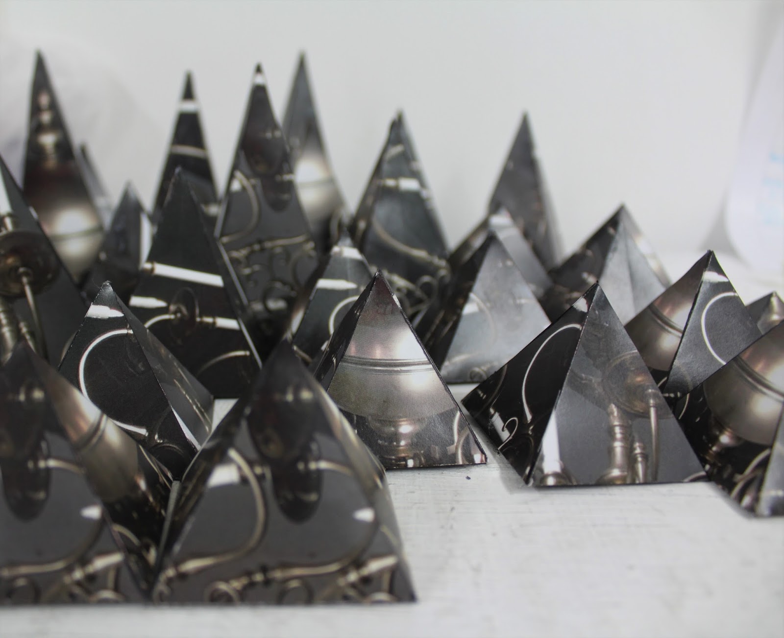
I wanted to try and find how i could make my collages 3D so they were more interesting than just being flat on the page. i thought of how you make cubes in primary school by making nets and applied the same theory.
I cut the pieces quite large for the first attempt so it was easier to work with but this actually made it harder to work with when i was trying to put it into a collage. this resulted in it not looking as neat as id like when it was looked at face-on as i normally like the collages to be compact and busy with little spaces in-between.

When you're looking at the collage from the side you can see that its 3D and ho i've done it without looking too un-neat.

On my second attempt at a 3D collage i made the pieces smaller so they could fit together a lot easier and i think it looks a lot more successful. i like how face-on it almost looks flat until you move around the collage.
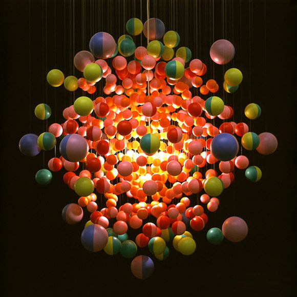
i used the image of the chandelier intertwined with a photo of the alter with a stained glass window so i could combine the twi images i was most interested in.
This collage took a lot of time to create so i need to look at easier ways to create it which are less time consuming so i can experiment easier and quicker.
Both collages look very similar from the sides because they were made using the same technique. however, id like to find a way that makes the work look more professional and clean from the side.
i intend on experimenting to see if i can make the points stick out more which will mean ill have to cover the white bits. i'd like to see how it looks with the same image around it or a different contrasting angle.


 When you're looking at the collage from the side you can see that its 3D and ho i've done it without looking too un-neat.


 John Stezaker
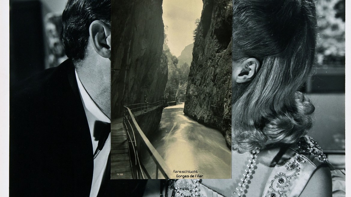


.jpg)


.jpg)


