Showing posts with label Studio2A. Show all posts

Sunday, 26 February 2017

Studio - Looking at colour

Friday 24th February, 2017
Looking at colour.

This week we had critiques and mine went quite well. The response to my paintings was a positive one and I got a few ideas from it. I want to start looking at colour within paintings as well as the shapes within them.


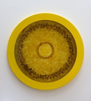
I really wanted to paint my board black and then painting on top of that so that when the masking tape was peeled off, it would reveal a black background instead of the previous white ones. I didn’t initially intend on this being just a two-tone piece but as soon as I begun to sponge on the copper paint I knew it would look great with the black and I was thankfully right. Although the paint bled through the tape in a few parts I think this is a successful; piece because to me it is aesthetically pleasing. There is a nice contrast between the dark matte black and the metallic copper. The black definitely makes for a different mood to the painting than the white, it makes for a more sombre attitude. 


It was suggested in the critique that I try using the same colour but with added black and white as to create different shades throughout a single piece. I consider this piece my most successful this semester, as I love the aesthetics of it. This was a depiction of my orangery roof at home and because of the line running down the middle, it seems to cut the painting in two, letting the eye run across the top, leading to the bottom layer. Using the same colour in different tones make, the shapes form together nicely although they have these expanses of white between them.

Monday, 20 February 2017

Studio - Masking tape painting

Monday 20th February, 2017.
Masking tape painting.


Instead of using a pencil to mark out the lines of the shapes I wanted to create, I used masking tape instead so that it would make bold white lines across the board. I tried this technique first on a small A4 board with only five colours. I did this because I didn’t want to over-complicate the piece with the element of colour so I didn’t think too much about that at this stage. 


I think using the masking tape makes the painting very successful. The bold white lines make the shapes clearer and frame them. I also sponged white with the colour as I didn’t want the painting to look too dark and I think it looks light and aesthetically pleasing while still having interest in its perception.


I tried the same technique on a bigger scale and on canvas instead of a board. The masking tape still made the same visual aesthetic however, I think I tried to fit too many objects into this painting so some of the simplicity of the first is lost within the busyness of this piece. The sponged –on white paint still gives the painting a soft look and is a technique I want to carry on using in my painting because of the interesting texture it also gives the painting.


Friday, 17 February 2017

Studio - Knowing what i'm doing finally

Friday 17th February, 2017.
Knowing what I’m doing.

After a lot of deliberation and tears, I know what work I’m producing for my studio module this term. Before, I was just putting geometric shapes on a canvas and hoping they worked. Through the help of my tutors, I have found a much better way of working.

My strategy for making my work now is to draw little observational drawings of a place or object in a space and then to disfigure and manipulate it into geometric forms on a canvas or board. This has worked really well because it isn’t guess work as to what I’m trying to manipulate.


This was the first piece I produces for this module and I disliked it so much I didn’t finish it. There was no organisation to where I was placing the shapes or what colours I was using. Because of the dis-organisation the colours and shapes don’t look like they belong in the same painting. The only aspect that I liked about this painting was it’s background. I applied metallic paint to a piece of crumpled paper and dabbed it onto the board. I also did this with the silver in the circle.


After taking my tutors advice of using observational drawings to form my painting I produced this painting. This was of objects in the studios that I had manipulated into my perception of them. There are elements of it that I like such as the complimentary colours and each colour has a partnering colour. However, the overall aesthetic is messy and unorganised. The white lines do not match up correctly and the shapes are not emphasised enough. 


Thursday, 1 December 2016

Studio - Family photos

in the crit the photos id combined together of my grandparents wedding got the best feedback so i have decided to return to this and develop this side of my practice and move away from flowers to focus more on the generations/family aspect. 


i found and scanned images of family photos of when i was young which were in colour and different to my first collage.

i tried it in black and white to see if it would have the same effect as the first one but because the images are clearly more modern the black and white effect does not work as well. when i present the series i'd like to see the progression through time and i think changing from black and white to colour photography is a big part of this.


Dsineyland Paris, 1999

Italy, 1979

Lanzarote, 1998

Monday, 21 November 2016

Studio - combining flowers


i combined flowers instead of photos to convey different periods in different peoples lives.
i chose to use the birth flower of august to represent my life at this point (new born) and a wilting flower for my granddad.
i like the look of the finished piece because you really have to look through the image to make out the flowers because it is so busy with multiple images.

Thursday, 10 November 2016

Studio - combining photos

in the crit an idea someone gave me, in response to my recent flower combinations, was to combine multiple photos together instead of just two.
i started with combining all the photos of my Granddad and Grandma's wedding. the end result is a canvas of black and white unclear shapes. i like how you can only make out images within the piece if you study it closely. i think it would have been more successful if there were less images so they were clearer to make out.

the next collage i created was with just group photos from the wedding. because the photos are black and white it makes the collages have an eerie quality, it makes me think of memories in the mind. 

This was using just photos from the wedding of just my grandpa and grandma.

this collage combines photos of when my grandpa was young

And this was just two photos combined of young and old photos of him

for this collage i used an image of when she was a baby, young girl, her wedding, her with her children and the final nice photo we have of her. i combined them all together to make a collage symbolising her life.


i think the most successful was the first one because it doesn't look like photographs until you get closer to it.

Wednesday, 9 November 2016

Studio - opacity flowers

I prefer using my own drawings instead of  photos found on the internet as it makes the art more personal. i still wanted to combine the family photo and the flower and experimented with layering them on top of each other, changing the opacity.


I think this series is a lot more successful than the previous because they are my own drawings and because the flowers are not as obvious. the first one (the baby) is the most effective in my eyes as the flowers cover the image. I don't think the rose works as well in the wedding photo because its too busy and full, i think it would have looked better if id have placed it only slightly in-front of their faces or lowered the opacity even more.


Monday, 7 November 2016

Studio - photo-shopped flowers

I tried combining the photos instead of having them separate to make them one image instead of two separate elements.
Jasmine, Cape: I am too happy
Camellia Japonica, White: Perfected loveliness
Rose, red: Love
i wanted to also see what it would be like to move away from flowers and just combine the generations in one photo. i like how its unclear to make out who the little girl is because there's such an age gap but i also like how it looks as though shes just an on-looker because of both photos being in black and white.

Saturday, 29 October 2016

Studio - flowers representing the life cycle.

i decided to look at photos of my grandma throughout her life and find flowers which best represented the stages in her life. 

Baby's Breath: Innocence, pure of heart.
Primrose: Early youth.
Red rose: Love.

i find it interesting how flowers can have so much meaning behind them without people knowing it.

Monday, 24 October 2016

Studio - week 4 crit

In the crit last week i got some really good feedback for my idea of looking at flowers in relation to a humans life span. a question which was asked was whether or not i should move away from flowers and look purely at the human side of my work however, i love working with flowers and it has become a crucial part of my own practice which is why i think i will carry on with working with flowers.


Georgia O'Keeffe was a name that was mentioned because of the symbolism in her work. because i'm looking predominantly at women's lives (flowers are feminine) id like to create some work that looks closer at the flowers forms.


Mary Kelly's Mother and child work was also mentioned. her work shows the relationship between her and her new born son in media other than just photographs. id like to experiment with text pieces to do with my mum and the relationship she had with her own mum and the one with me as a child and when i was growing up.

Sunday, 16 October 2016

Studio - Scientific illustrations

example of a scientific botanical illustration


After looking at an artist called Marianne North and how she went against the scientific botanical images, i decided i wanted to do the opposite. i liked the clinical and scientific look of these illustrations she decided to go against. 


I'd drawn in this style before many times and it has become unique to me. it looks similar to the scientific images i found and i think it works better than just a photograph next to the baby image as it looks more organic and fitting.


Id like to present this image on the wall with just the text "Gladiolus, the August birth flower".

instead of just looking at one persons life i want to experiment with looking at multiple generations of the same family. for example my own; me, my mum and my grandmother. i want to experiment with the text which i put next to each image. whether it be a mini biography of each person demonstrating how each generation has been brought up differently and how the times have changed between each one, or whether it be a simple depiction of what the image (or the flower) is.

Saturday, 15 October 2016

Studio - wrethes to pleasure

Helen Chadwick created a series of images called 'wreathes to pleasure'.   Each image captures a sculptural composition formed of a heady mix of substances and materials, photographed from above. Delicate flowers are suspended in transient states, poised between life and death, in a variety of organic and toxic liquids ranging from tomato juice to Windolene.


Chadwick often referred to the 'Wreaths' as 'bad blooms', explosions of form and colour that are simultaneously seductive and repellent.

Studio - birth flowers

For every month of the year there is a birth flower:
MonthFlowerSymbolisation
JanuaryCarnation[2]Love, fascination and distinction. Worn on Mother's Day, Teacher's Day, St. Patrick's Day (in green, of course) and at weddings, this hardy, sweetly fragrant flower is also the flower of Spain.
FebruaryViolet[3]/IrisFaithfulness, Wisdom and Hope. Violets convey the meaning that you will always be true. Violets come in shades not only of Purple, which is what people commonly think of, but also of White.
MarchDaffodil[4]Spring, Rebirth, Domestic Happiness, Respect, Regard and Friendship. The Daffodil is synonymous with Spring as it is the epitome of rebirth and new beginnings.
AprilSweet Pea/DaisyLove, Youth, Purity. The Daisy conveys innocence and there are five common types.
MayLily of the ValleyHumility, Chastity, and Sweetness. Sweetly scented and rare this flower also signifies a return to happiness.
JuneRoseLove and Appreciation, while other meanings depends on each colour. The meanings of Roses can vary from Love, Passion, Beauty and Perfection. The meaning depends upon the colour. For example, Red says love and romance, White symbolizes innocence, purity, and remembrance.
JulyLarkspurLevity and Lightness. Its natural beauty comes in gentle hues with refreshing fragrance. There are different meanings for each colour. Pink denotes contrariness, White expresses a happy nature, and a first love is usually symbolized by Purple. Strong bonds of love are represented by the Larkspur.
AugustGladiolusStrength, Moral Integrity, Remembrance, Infatuation. This long lasting flower comes in a variety of colours.
SeptemberAster/Forget-me-notPatience, Daintiness and Remembrance. This flower conveys deep emotional love and affection.
OctoberMarigoldWarm, Fierce. They exemplify elegance and devotion.
NovemberChrysanthemumCompassion, Friendship, Joy. Chrysanthemums have different meanings. Red is for Love, White means innocence, and Yellow denotes unrequited love.
DecemberPoinsettiaGood Cheer, Success. The Poinsettia comes in three colours Red, White, and Pink. “You Are The Special One” is the message this flower sends.
My birthday is in august so i placed a photo of me as a new born next to a Gladiolus. however, i'd like each photo collage to be of the same person through different stages of their life so i'll need to choose someone who is already gone so i can portray each stage of their life through flowers.

Wednesday, 12 October 2016

Studio - 'Final' ideas

After doing more research, and especially since looking at Marc Quinn and Azuma Makoto, i have decided through this project i will be looking at how a flowers life span is similar to that of a humans.
I want to find out what different flowers mean at different stages of life. i want to create a series of images with a photograph of a moment in a humans life, next to a either drawing or a photograph of the flower which best represents that moment.

Studio - Marc Quinn

Through talking to medina about where i was with this project, or where i wasn't, she gave me the names of some artists to look at for inspiration and one of them was Marc Quinn. at first when i looked at his work all i thought was that it looked pretty. however, when i read his overview of these paintings i became really interested. the work is about how "human desire has created new seasons - bringing together in one geographical  location...their beauty belies a sinister subtext: the relentless human desire to control nature". 


I also found his flowers sculptures on his website which i've actually seen at the Yorkshire sculpture park. He describes his sculptures as "the purest and most magical transformation of reality into art". 


My own image


Sunday, 9 October 2016

Studio - changes so soon

After looking at Azuma Makoto's work it has completely altered where i want to go with my work in this module. i still want to look at flowers through a microscope to be able to see what we cant with the naked eye, but i also want to start looking at the preservation of flowers. I briefly touched on this last year when i was looking how flowers deteriorate and would really like to look further into it with experimentation. Makoto's "Iced flowers" has given me great ideas into how to explore the preservation of natural and botanical materials.

Studio - artist research

i wanted to find artists who looked primarily at flowers and from a close proximity. a simple search helped me find these artists:

Alyson Sheldrake

  • self taught artist,
  • focuses on the centre of the flower - the most detailed and interesting part,
  • i really like how she's not delicate with her brushstrokes but are still controlled.  


Teresa Dye
  • very similar to the previous artist but has more realistic work.


Laura Iosifescu
  • i was really drawn to the bright colours in her work,
  • noticed the sharp lines and shapes hidden in the work and instantly connected with it,
  • i find myself looking more at whats in the background of the picture instead of the forefront. 


    Azuma Makoto

    • completely in love with his work,
    • fascinated by the way he exhibits his work and how he represents flowers and nature.