Monday, 23 October 2017

Possible Final Design

I created another drawing but one that could stand on its own without needing to be connected to another piece to make it flow. This pattern is my favourite so far because it is simple but with plenty of detail. Its clear the original is hand drawn which is important to me as I want my wall paper to show skill and effort.

I tried putting this image in a pattern to print onto wallpaper. When I just put the image into straight lines it looked too formal to be wallpaper and boring. I experimented with different designs to see how I could make it interesting to look at if it were to cover a whole wall or room. After trying multiple different patterns I decided rotating the pattern through lines was the one which looked the most aesthetically pleasing. The turns are to symbolise the different ways the flower can be viewed however the print still looks too stiff and not organic.


I also experimented with backgrounds but it took away from the design and from looking at other wallpaper samples I decided I would definitely not be having a background. It made the pattern look too busy even on a small scale. A blank background makes the pattern stand out much more and looks more clean and professional.


Thursday, 19 October 2017

Wallpaper Samples

I went to a DIY store and looked at floral wallpaper samples to see what qualities they commonly have. This sample was a favourite of mine because the collections of flowers look like they are coming out of the shadows behind. It has a blank background which makes the flowers stand out a lot more than if there was another pattern behind. The soft colours are also attractive to me because they are not garish like others.

This sample is very different from the others as there is a pattern stretching behind the roses. The pattern distracts from the roses and makes the overall presentation look busy and unorganised. The colour scheme being very similar throughout the sample makes it difficult to see the roses that are meant to be the most prominent feature. Because of this I don’t find it aesthetically pleasing, which is very important to me in my work.


 Although the flowers in this wallpaper are too animated for my liking, the bright colours distinguish what is the main focal point of the pattern. The way the pattern follows on from each other from a vine is attractive as it leads the eye through the pattern. However, the pattern is very simplistic and doesn’t have many elements to it. Because of this the viewer can’t be intrigued about the pattern because there is very little to it.   

This pattern is like the previous in that the pattern runs through the roll by a connecting leaves and vines. This sample is more realistic and with a much more muted colour palate to the previous. However, it has gone too far the other way and isn’t eye catching with such little colour and substance to the pattern. The outline of the flowers without colour makes its centre more of a focal point, but it still lacks much detail and substance.

 This sample is by far my favourite. The pattern leads the eye through the wall with different elements. Although I think that the dragon flies and butterflies are unnecessary I understand that this wallpaper is for domestic use. The different colours entice the eye and the simple pallet is aesthetically pleasing. The darkness of the background really makes the light colours stand out but I imagine this to quite an unpleasant background colour if it were to cover an entire wall.  

From looking at these different samples I have decided that the pattern I want to create for my ‘wallpaper’ will have a plain background so all the detail can be centred on the pattern itself. I also want there to multiple flowers running through it so that there’s substance and makes the pattern aesthetically pleasing. My ‘wallpaper’ will be coloured but I want to stick to a simple colour pallet so I don’t take away from the effect of the pattern.

Tuesday, 17 October 2017

Adding Colour


All my previous drawings have been strickly black and white. There was no reason for this other than it looking bold simple. However, most wallpapers have colour and those that don’t look bland when they cover an entire wall or room. I decided to add colour to one of my drawings of roses but I chose to go with its original colours instead of making it abstract.


My drawing looks a lot more effective with colour than without. The colour stops the pattern looking basic and like a colouring book outline. It also looks much more like a wallpaper when the pattern is lengthened. I will adding colour to my future drawings and patterns as I think it is an improved development in my practice. 

Helen Chadwick

Helen Chadwick (18 May 1953 – 15 March 1996) was a British sculptor, photographer and installation artist. In 1987, she became one of the first women artists to be nominated for the Turner Prize. Chadwick was known for "challenging stereotypical perceptions of the body in elegant yet unconventional forms. Her work draws from a range of sources, from myths to science.

The Wreaths to Pleasure consist of thirteen colour photographs, each depicting different flowers and fruits set against and within both pleasant and poisonous liquids: tomato juice, melted chocolate, and detergents and soaps like Windowlene, Fairy, Ariel and Swarfega, and Germolene antiseptic cream. Shot from above and framed in the artist's own circular brightly coloured enamel steel frames, the works were the result of several years of experimentation by the artist. Each Wreath to Pleasure started as a sculptural installation, made within a shallow circular tank within which she would spread the liquids, gels, juices, flowers, and fruit, in a unique combination that would then be photographed.

This series illustrates Chadwick's depiction of a transient world of visual and sensorial pleasures and execrations, where both aspects collide: at the same time joyful, aphrodisiac, nauseous and abject. Chadwick examines the notions of desire and repulsion, life and death, beauty and ugliness by analysing - almost with a scientific approach - the fluidity of our existence and the matter that constitutes it.

I’m attracted to Chadwick’s Wreaths of Pleasure because they are aesthetically pleasuring. The colour schemes of each one are complimentary and I find their circular framing a contrast to traditional classical frames. How Chadwick uses flowers in her work in innovative by submerging them in materials which will cause them to die. Similarly to Anya Gallaccio, Chadwick centres her art around the decomposition of the natural material. Also like Gallaccio, Chadwick forces nature into geormetric shapes. This is appealing because it conrasts with the fluid and unpredicatable nature of the material. Chadwick is a nice contrast to my work where I try to preserve the flower, she tries to amplify it’s decaying. The bold colours in each ‘wreath’ are eye-catching and make the collection stimulating. From looking at her work I would like to introduce colour into my own. 

Monday, 16 October 2017

Patterns and Scale

I like my work to look clinical as I believe it looks more professional and clean when it is presented. When something is messy and out of place in a piece it causes slight OCD tendencies.

Without the pattern in my work, it eliminates the reason for looking at the Fibonacci sequence and natural materials (flowers). I decided to look at scale again but oppositely to how I previously considered it in my work. I made the flower pattern smaller. I made the pattern even smaller so that it became almost like an optical illusion. From further away it doesn’t look like a flower at all but a few dots on the page, until you get closer and see the drawing. Although the smaller scale makes the image interesting to look at, I want you to be able to see the drawing of my work. If you can’t see that the image is a flower then it might as well be anything. It is important the image of the flower can seen otherwise it has no links to the sequence. 

This drawing doesn’t work best as a sequence because the eye is drawn too much to the centres of the flowers, they are too dark in contrast to the rest of the image. As a pattern spread across a wall like wallpaper it not be as aesthetically pleasing as other drawings is have created.


Friday, 13 October 2017

Scale and Paul Morrison


While looking at my line drawings my tutor suggested I look at the scale of which I was drawing them. He helped me to print my drawing out large like an artist who he introduced me too: Paul Morrison. Although he went to University in Sheffield (where I’m from) I wasn’t familiar with him but found my work really relates to his. He creates botanical drawings, mainly in monochrome. His “boldly rendered gardens and landscapes are magnified, distorted, and cartoon-like, appearing through various mediums in paintings, drawings, prints, sculptures, and film. Morrison consciously shifts scales and takes inspiration from timeworn engravings, botanical illustrations, comics, animations, and found images.”

On a photo of his works you do not guess that it is as tall as a building. This made me think about scale within my own work and when we blew my drawing up large the overall image was arresting on the wall because it invaded the space with how much larger it was.


I aesthetically appreciated how my drawing looked large however if I were to make them all this big I would unfortunately not have the space to include the repetition of the flowers, thus getting rid of why I’m using flowers in the first place; because they follow the Fibonacci sequence.
I also found that when I blew the image up the quality of the image recreated and became pixilated and not sharp. If I were to create drawings with the intention of them being large scale I would make them larger to begin with to get rid of this problem. 


Tuesday, 10 October 2017

A step backwards and line drawings

After looking constructively looking at my lino prints I have decided to take a bit of a step back from printing and study the objects instead. I have always enjoyed making detailed observational line drawings and this is what I do most when I am not creating work for university, but for myself. These drawings have detail in them that I have not been able to achieve in a print. I also see more skill in them because of the detail than in the prints. I plan on making symmetrical images from these drawings and then making them into prints to make wallpaper.


Monday, 9 October 2017

Claude Monet

Oscar-Claude Monet (November 1840 – 5 December 1926) was a founder of French Impressionist painting, and the most consistent and prolific practitioner of the movement's philosophy of expressing one's perceptions before nature, especially as applied to plain-air landscape painting. Masterful as a colourist and as a painter of light and atmosphere, his later work often achieved a remarkable degree of abstraction, and this has recommended him to subsequent generations of abstract painters.

Inspired in part by Edouard Manet, Monet departed from the clear depiction of forms and linear perspective, which were prescribed by the established art of the time, and experimented with loose handling, bold colour, and strikingly unconventional compositions. The emphasis in his pictures shifted from representing figures to depicting different qualities of light and atmosphere in each scene.

Monet has long been one of my favourite artists because of his use of colour and his application of the paint in his paintings. In 2016 I was lucky enough to view Pink water lilies (1897-1899) in the Galleria Nazionale d'Arte Moderna in Rome. The painting’s pastel pallet and soft brush strokes combined with Monet’s subtle changes of colour create an outstanding piece of artwork. It is of no surprise to me that the paintings in Monet’s Water Lillie series are classes as masterpieces. His work is much more expressionistic than my own as in my current work I am favouring a more stripped back clinical drawing style. Looking at Monet’s work has influenced my decision to look more closely at the flower itself and to create more detailed drawings focusing on the object instead of the medium in which I am presenting it.

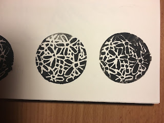
Circular prints

After trying to print with rectangular sheets of lino I tried circular to see if this would look better once printed. I used a small piece of easy cut that I got in a set instead of lino to see if it would be easier to use. The material is hard to carve and smudges easily when printing. I won’t be using this material to print with as I don’t think it gives a very precise print. It was hard to control the material when carving so the depth of the lines are very different. Although the circular shape is more interesting to look at than my previous prints, I can’t get any detail into the print because they are too small to carve a detailed image into.


First lino prints

To get a more accurate print I chose to try lino printing. This technique is easier than using wood carving like William Morris and a lot less time consuming. I used a () to draw from as I prefer to draw from either observation or my own images.


t has been years since I used lino printing and at first, I could not get the quantity of the ink right on the print. There was far too much and it made the print unable to display the image because the ink was getting into the carves. And then there was too little ink so you could not see the image or it moved while I was printing so the image was smudged.


Eventually I got the technique correct and got the image I wanted. I still wasn’t completely happy with the print so I got rid of the background so that the flower had a boarder round it so the image could be repeated without there being too much black. 

I like final prints but I still think they are not precise enough for what I was wanting to achieve by making my own wallpaper. I want to experiment more with printing to see if I can get the prints more precise. The overall look is still too messy and uneven. I also want to experiment with the shape of the print to see how this would look if it was a repeated pattern on a wall. This was only a small any would confuse the eye if it was on a whole wall so I want to experiment with scale.

Sunday, 8 October 2017

Printing with natural materials

I was asked why I wanted to print with flowers and it was suggested that I try using other natural materials. I got a Romanesco broccoli which is one of the best examples of fractals and symmetry in nature, and a pineapple which also shows symmetry in its outer patterns.

Both materials were difficult to print with. With the Romanesco broccoli, it was difficult to print its patterns because there are so many dips that you can’t print. Although the object itself is interesting enough to be a piece of art, I would have loved to have been able to print its fractals. I rolled the broccoli across the page to see what marks that would make and it was not successful because they are just dots front the highest points. I also tried just printing a small floret which worked better because you can see that natural pattern more. 

I next tried printing with a pineapple. The prints I got from the pineapple were less successful than the broccoli. I was hoping you would at least be able to see the almost honey-comb pattern around the outer skin but it would not print so it was visible. I tried rolling the pineapple through paint to try and get the pattern but it resisted and would not print well. I rolled the pineapple across the page, like I did the broccoli, but because if its shape not being flat I couldn’t get the pattern to print. I also tried printing the bottom of the pineapple which I think it the most successful print as it looks interesting but it does not look like a pineapple and you cannot see the patterns that I was trying to demonstrate.

Both prints in my opinion were failures. They didn’t create the desired image of interesting prints, the prints don’t look like they have come from a Romanesco broccoli or a pineapple. I will contue to research prints and the how to gain the best results however, I will be developing into lino printing instead of printing with the natural material in hope of getting a clean precise image/print.

Friday, 6 October 2017

Printing with flowers


It was suggested in the first session by a peer that I try printing directly with the flower instead of using lino prints, I liked this idea so I experimented with it. I was going to use black so I could see the detail more easily but I chose to use a pale blue to match the delicacy of the flowers. I would try this experimentation with black because although the blue looked affective, the little contrast to the page made it difficult to see the print.

In my work symmetry and a clinical look is important to me. I like my work to look clinical so that the eye can easily distinguish the marks I make in my work. With flower printing, this was hard to do because no print will be the same, the paint will coat the petals differently and petals would fall off because of having to be pushed down.


They are interesting prints to look at because with some it is not clear it is a flower which is intriguing. Because of the dips in the flower you are unable to print all of it so you can’t see the whole image. I won’t be continuing with printing with the flower because it is not a way of printing which will give me a detailed image, which is what I wish to achieve with my prints.


Tuesday, 3 October 2017

Anya Gallaccio

Anya Gallaccio (born 1963) is a British artist, who creates site-specific, minimalist installations and often works with organic matter (including chocolate, sugar, flowers and ice).


Her use of organic materials results in natural processes of transformation and decay, meaning that Gallaccio is unable to predict the end result of her installations. Something which at the start of an exhibition may be pleasurable, such as the scent of flowers or chocolate, would inevitably become increasingly unpleasant over time. The timely and site-specific nature of her work make it notoriously difficult to document. Her work therefore challenges the traditional notion that an art object or sculpture should essentially be a monument within a museum or gallery. Instead her work often lives through the memory of those that saw and experienced it - or the concept of the artwork itself.

Although Gallaccio uses the literal flower instead of its image, I find her work important to my practice because at its core is natural materials. Gallaccio uses the natural materials directly where as I perceive them in drawings. A number of her works are centred around the preservation and decay of natural materials, in my practice I wish to preserve the image of the natural material through drawings.


preserve ‘beauty’ is an installation work composed of bright red flowers arranged in four adjacent rectangular compositions underneath large panes of clear glass. The flowers are presented in a single layer with their heads facing out towards the viewer, and their stalks are positioned downwards, so that the lower edge of each panel features a band of green made up of the stems of the bottom row of flowers. The type of flower used in the installation is a hybrid between a gerbera and a daisy that is known by the name ‘beauty’. During the period in which preserve ‘beauty’ is displayed, the flowers wither and die, and this decay process is visible to viewers through the glass.

Monday, 2 October 2017

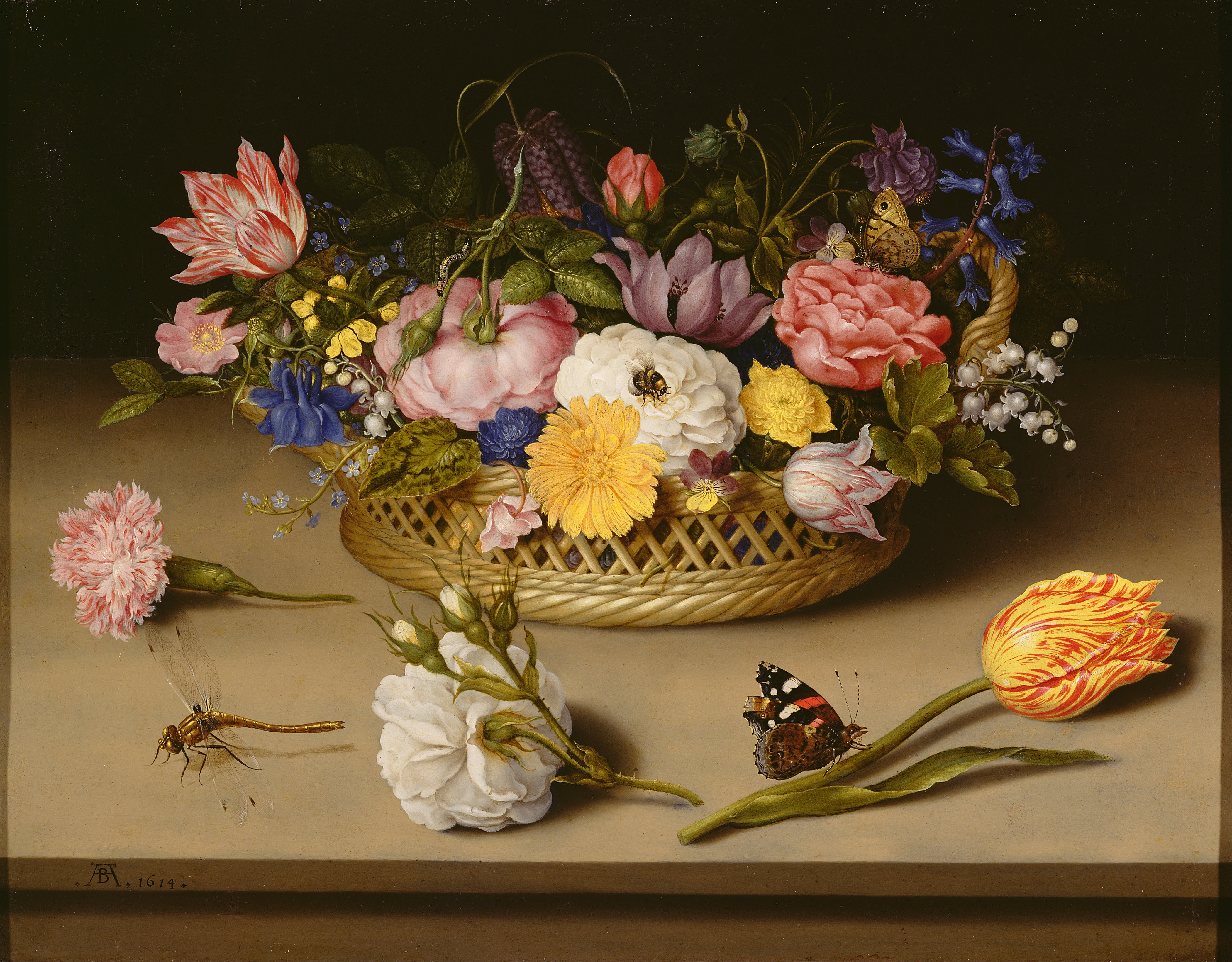
Ambrosius Bosschaert

I felt it was important to look at a historical flora and fauna painter as my practice at current is based around the representation of flowers. Ambrosius Bosschaert the Elder (18 January 1573 – 1621) was a still life painter of the Dutch Golden Age.

Bosschaert became one of the first artists to specialize in still life painting, and he started a tradition of painting detailed flower bouquets, which typically included tulips and roses. His bouquets were painted symmetrically and with scientific accuracy in small dimensions and normally on copper. They sometimes included symbolic and religious meanings. 

Sunday, 1 October 2017

William Morris

William Morris (24 March 1834 – 3 October 1896) was an English textile designer, poet, novelist, translator, and socialist activist. Associated with the British Arts and Crafts Movement, he was a major contributor to the revival of traditional British textile arts and methods of production. His literary contributions helped to establish the modern fantasy genre, while he played a significant role in propagating the early socialist movement in Britain.

Morris's name and reputation are indissolubly linked to wallpaper design, but there is a tendency to over-estimate the influence he had in this field. In fact, despite his much-repeated belief in 'art for all', his wallpapers, like most of the products of Morris & Co., were hand-made and expensive, and consequently had a relatively limited take-up. His sources were plants themselves, observed in his gardens or on country walks, and images of plants in 16th-century woodcuts, illuminated manuscripts, tapes-tries and other textiles incorporating floral imagery. His designs were not to be literal transcriptions of natural forms but subtle stylised evocations.
Although he advised those designing wallpapers to 'accept their mechanical nature frankly, to avoid falling into the trap of trying to make your paper look as if it were painted by hand', he also encouraged intricacy and elaboration so that the repeat itself was disguised.
Morris created his wallpapers through woodcuts so there had to be a repeat to support this, making his prints symmetrical. This is an element of his work which I find attractive because to me, it hints at the repeated nature of flowers. In my work, I am hand drawing my image so that it is more handcrafted. Because of this process I won’t be able to achieve an easy symmetry in my patterns however I will be striving for symmetry as I think it works well at hinting at the symmetry within the flower itself.

Strawberry Thief’ is my favourite of William Morris’ prints because it incorporates so many different aspects of nature; birds and wildlife, plants, fruit and flowers. It also has the cheekiness from the birds ‘stealing’ the strawberries which makes the print endearing. If I were to critique Morris’ prints I would say that for me personally, there is too much emphasis on the leaves instead of the flower across his prints.

Each print sticks to certain colour palates, with some having quite dark background but bright forefront colours to contrast this. The colours highlight key aspects of his work and I want to look further at this feature within my own prints. I would like to experiment with backgrounds, however with my drawings having a think black outline I think a dark background would make the print less of a feature.